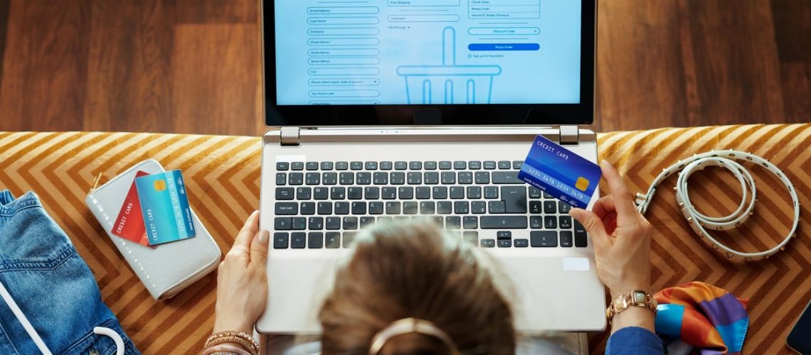
Sales page conversion rates average about 2 percent. This means that for every 100 visitors, two new customers can be expected. And honestly, that’s a pretty good conversion rate.
Many websites have only a 0.1 to 0.2 percent conversion rate from visitor to customer. In order to gain a single customer, these sites must attract as many as 1,000 visitors.
How can we improve conversions to gain more customers with the traffic we already have?
How to improve the conversion rate of your sales page
1. Get rid of unnecessary fields in forms and anything that diverts the visitor’s attention from the purchase
A complicated form with many fields that are not crucial to the purchase process can deter a customer. The forms should therefore be as simple and understandable as possible.
Another problem arises if a website wants to communicate too many different things to a visitor at once. The messages on the sales page should be understandable by directing the visitor to make a purchase. If any information is not relevant to the purchase decision, do not include it.
Structure the sales page clearly with titles and subheadings, present the advantages and characteristics of the product / service and possible opinions of satisfied users, and above all make sure that the offer is also presented visually (photo, video, illustrations, animations).
2. Highlight the opinions of satisfied customers and product reviews
No one wants to be the FIRST person to buy a product or try a service. The opinions of existing customers and their product ratings in a prominent place will instill confidence in your product to potential new customers. If it is a B2B offer, you can display the logos of companies that use your services.
3. Make the call to purchase / order / register (CTA) as encouraging as possible
Experience shows that generic calls to action are not the most effective, so try something more dynamic and encouraging instead of ‘Sign Up’ and ‘Buy’. Try more active forms like ‘I want to sign in’, ‘Order a product’, ‘Add product to cart’ or ‘Buy product.’
4. Simplify the first step of the purchase process
We humans are psychologically inclined to complete something we have undertaken (unless it is too demanding). Take advantage of this by making the first step in the purchase process as easy as possible. Instead of asking a new customer to fill out a huge form right away, first ask them for an email address or sign up. If he loses interest later when he has to fill out a purchase form, you will still have his email address so you can remind him of the purchase interest.
5. Enable third-party login (e.g. Facebook or Google)
Speaking of endless forms that discourage visitors from making a purchase: allow them to sign in with a third party, such as Google or Facebook, so this step will only take them a second.
6. Add a pop-up to the page
Although most web users agree that pop-ups are annoying, statistics about their success say otherwise. A pop-up in the right place can achieve a 10% conversion or even more. Just make sure you show the visitor a pop-up only after a certain amount of time on the page (say 30 seconds) and show it to them only once.
7. Try different offers, titles and texts
If you don’t compare different options, you’ll never know if your conversion page conversion is good or bad. Maybe its at 4% now, but it would be higher if the visitors were addressed with a different message or if the product / service was presented in a different way.
8. Personalization!
Probably the most effective way to increase conversion of a sales page is to tailor its content to visitors. Behavior Exchange technology allows you to automatically adjust the content of the sales page and offer to each individual visitor according to their personal characteristics, past online behavior, needs, and interests.
Check out how you can personalize the content of your website or advertising campaign with Behavior Exchange technology!


